


We really can’t be bothered with having the GERS “debate” again, in which all the same people make all the same exactly opposite spins on the exact same data. Minor annual fluctuations aside, the core reality is the same as the one we repeat every 12 months, and serious economists on both sides of the political divide still treat the figures with the disdain they properly merit.
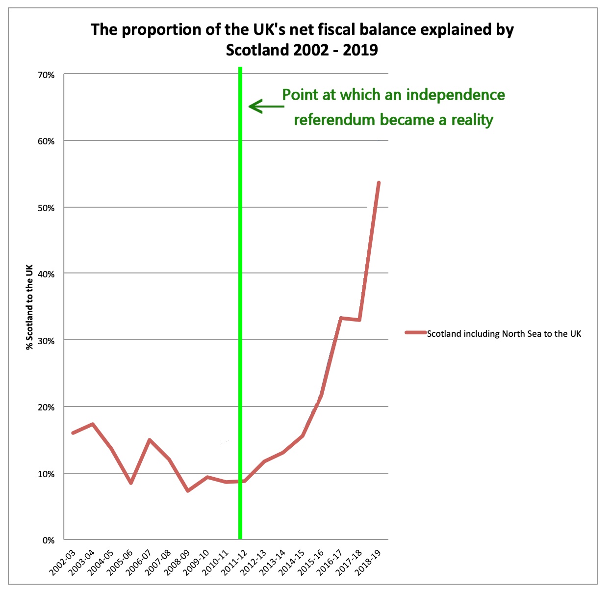
One such person is Richard Murphy, and in an excellent piece today he posted a version of this graph which did catch our jaded eye. It purports to show the share of UK debt supposedly accounted for by Scotland – which has, let’s remember, just 8% of the UK’s population – in each of the last 16 years, and which immediately prior to the SNP’s 2011 majority stood at almost exactly that of our population share.
(Which is itself a gross calumny against reality, but let’s stay focused.)
How very remarkable, readers may feel, that the extent of Scotland’s supposed responsibility for the UK’s debt should have rocketed so very dramatically at the exact point when independence became a live political question.
It does rather make you wonder why the UK government, scraping as it is for every penny of possible savings, grows more and more desperate to hang onto Scotland as the terrible economic burden we become on the rest of the country grows ever heavier.
Truly, our partners in this great equal and bountiful union must be the most generous and forgiving people on Earth. We don’t deserve them.


