



When the news is slow, we sometimes steel ourselves and go for a little paddle in the Yoonstream – a private collection of the most unhinged hardcore-Unionist accounts on Twitter – and see what they’re getting themselves all worked up about.
For a good few months now, they’ve all been posting mad graphs like this:
And we’re not quite sure why.
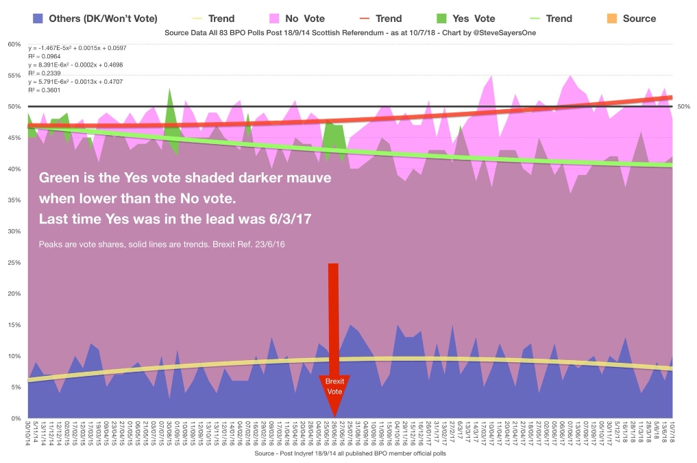
The one above is from longstanding rage-fountain Neil Edward Lovatt, whereas this delightfully pretty one is from noted loony and frequent Twitter-ban victim Steve Sayers (whose stupendous grasp of figures alert readers may recall from a previous example):
And this version is from our old favourite Duncan Hothersall today:

(Which has led him to make one of his legendary predictions.)

Whatever the visual styles, though, all of them purport to show the same thing: a striking trend of divergence between Yes and No support since the 2014 referendum, from neck-and-neck to a No lead of 10 points or more.
And the only slight problem with it is that it isn’t even a tiny bit true.
What Scotland Thinks records actual Scottish opinion polling since the indyref. It does so in a rather unhelpful way, splitting polls into pre- and post-EU referendum chunks with different Y-axis values, but you can still see the trends clearly enough.
(Click to enlarge the pic.)

And they are, in essence, that nothing at all has changed in four years. Depending on how you spin the stats you can suggest either a 4-point shift towards Yes or (at worst) a 1-point shift towards No since the vote, but in essence it’s all just margin-of-error fluctuation that amounts to zero. The odd one-off micro-blip aside, those graphs are visibly as flat as a pancake.
(This doesn’t mean nobody’s changed their mind, of course. All sorts of evidence suggests that as many as a third of Scots have probably switched sides, but in roughly equal numbers each way and therefore not affecting the overall situation.)
If you include DKs (and you shouldn’t, really, because as a rule Don’t Knows don’t vote), the numbers are like this:
NOVEMBER 2014
Yes: 49%
No: 44%
DK/WNV: 4%
JULY 2018
Yes: 42%
No: 48%
DK/WNV: 11%
That’s a 5-point No lead increasing to a 6-point No lead over the period. (But still less than the 10-point victory they recorded in the actual vote.)
If you exclude DKs, which is the generally more accurate measure, you get:
NOVEMBER 2014
Yes: 47%
No: 53%
JULY 2018
Yes: 47%
No: 53%
Which is no change at all, but again a reduction of 4 points in the No lead since the actual vote in September 2014, from 10 points to six.
The WST figures also exclude arguably more relevant variants on the question which have put Yes in a more favourable position, such as this one which cut the gap to 49-51, and this one – actually the most recent poll – which put Yes in a four-point LEAD.

But even leaving those aside, there simply isn’t a single shred of evidence suggesting ANY kind of trend towards No, far less a 10-point divergence since 2014. If anything the opposite is demonstrably true – Yes support in polls is higher now than it was in September 2014, and has been so in the vast majority of polls since then.
Don’t get us wrong – we’re sure there’s some sort of arcane statistical voodoo you can perform on this (or any) set of numbers to produce your desired effect, as memorably satirised by geek comic strip XKCD:

But that doesn’t make any of them actually mean anything. The cold hard reality is that despite the oil-price crash (which should have played very well for No) and the Brexit vote (which should probably have played better for Yes), Scottish public opinion on independence basically hasn’t moved at all in four years.
So anyone who tries to tell you – by drawing fantasy lines on top of real-data dots – that it has should obviously be regarded with suspicion and probably a fair degree of pity. Because they can’t possibly think they’re fooling anyone but themselves.


